Page 18 - Engage -- no.11 -- Winter 2018
P. 18
16
Winter 2018
PANTONE COY
Ultra Violet?
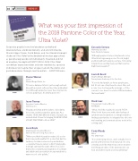
Enigmatic purples have also long been symbolic of counterculture, unconventionality, and artistic brilliance. Musical icons Prince, David Bowie, and Jimi Hendrix brought shades of Ultra Violet to the forefront of western pop culture as personal expressions of individuality. Nuanced and full
of emotion, the depth of PANTONE 18-3838 Ultra Violet symbolizes experimentation and non-conformity, spurring individuals to imagine their unique mark on the world, and push boundaries through creative outlets. - PANTONE.com
Consuelo Serrano
Marketing Specialist Penn-Florida Companies
“Although purple is truly not my favorite color, Ultra Violet is growing on me. It’s rich, bright, and bold without being in your face. I’m looking forward to an exciting new year that is just as bright and energetic!”
Laura B. Beard
Graphic Design Manager
Pennsylvania Academy of the Fine Arts
“It’s not a bad purple, as far as purple goes, but it’s not one of my favorite colors. Also not
a color I see too frequently in design — I’ll be curious to see how it is used in 2018 and where the trend leads.”
Hank Isaac
Principal and Creative Director 495Digital
“Wow, I feel like royalty! In a word: POSH. Ultra Violet leaves me with calm feelings of optimism and inspiration. Looking forward to finding opportunities to integrate this vibe into my branding and communications work in the coming year.”
Cindy Woods
Editor
The CMO Team
“It’s a interesting choice, and I actually love it paired with Greenery from last year. It’s very celestial, and I like that it has a more modern feel. Being an editor, I’ll be interested to see how and where it gets used in publishing.”
What was your rst impression of
the 2018 Pantone Color of the Year,
Sharon Werner
Owner
Werner Design Werks, Inc.
“It’s a nice balanced Violet - just enough red and blue with a muted, softness, like it has milk added to it. Although purple has never been my favorite color, as purples go, it’s a fairly good one.”
Jason Tierney
Executive Creative Director Shift Now, Inc.
“Royalty, well, that and the Lakers. I absolutely love violet, and this swatch in particular. As a creative I think that different shades of purple are
underutilized. Cheers to bringing 18-3838 ULTRA VIOLET, PANTONE to life in 2018!”
Laura Boyle
Marketing and Creative Director National Wood Flooring Association
“When you think of purple in nature, it’s a color that is rare and beautiful. It’s a color that has the tendency to make someone stop and admire
— a purple flower, a sunset, a bird. Using purple in design can have the same effect. It’s a color
that evokes creativity and inspiration. It’s vibrant and stylish and can easily be incorporated into a warm or cool color palette.”
C-71 M-73 Y-7 K-8 R-95 G-75 B-139


